This post will be somewhat different from the others I have made to this point. All of the information is available elsewhere and from more experienced teachers. It will only serve as a bit of an update to one activity I have been spending my time on.

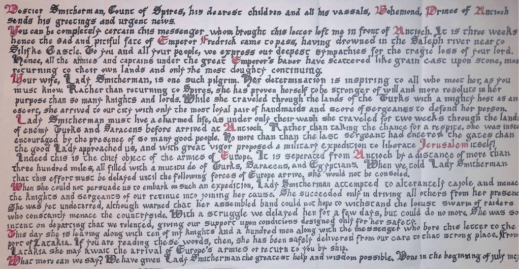
I first got the writing bug from a letter exchange group, where hand written letters based on a monthly prompt were sent to a randomly assigned member of the group. I naturally wrote the narrative in the context of my study, the 1190’s Levant. It also followed that the formatting and writing of the letter should be appropriate as well, so I consulted Letters From the East, which is a collection of extant letters between the Levant and Europe in the 12th and 13th centuries as translated by Malcom Barber and Keith Bate. I also took it upon myself to learn how to do calligraphy.
Over the span of a weekend I went from the most basic and large letters in Early Gothic script learned from The Art of Calligraphy by David Harris to the letter below (Figure 2). Like with many other things, I was not satisfied with this first attempt at the artform and set myself a very ambitious goal.
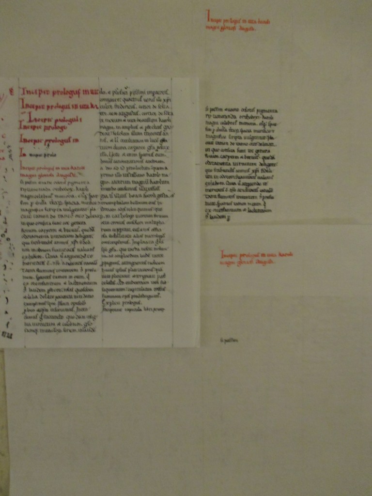
I naturally decided that my next calligraphy project would be to transcribe an entire book in medieval Latin, a language I do not know at the best of times and is heavily abbreviated in writing. My subject would be a version of Historia Karoli Magni et Rotholandi, or The History of Charlemagne and Roland; a sort of 12th century fan fiction and superhero team-up between two of the most popular characters of the time. Charlemagne and Roland were both heroes in their own chanson de geste, sorts of epic poems which were spoken or sung by traveling musicians. While I do not understand the language I would be writing, in practice it is irrelevant. To take the role of the medieval scribe I would only need to transcribe every mark from a source to a new page, which seems feasible.
The manuscript I settled on was Add MS 39646 from the British Museum. It is a late 12th century French example consisting of some 300 folios with writing on both sides of each, excluding some later additions. The pages are written on both sides of each page in a space of about 255mm by 155mm. The lines are spaced approximately 7mm apart and the text is in two columns. The British Library MS Viewer (bl.uk)
I started the first page on some locally acquired paper and quickly settled on it being a practice run. The more appropriate medium would be Pergamano Vellum, a synthetic vellum substitute. I acquired several sheets and began again, however this time the ink ran into the lines I marked on the page, an issue I couldn’t live with. I also noticed the the Pergamano Vellum I had bought was thin enough that it was translucent, potentially an issue with stacked pages and writing on both sides. I also had several issues with my pens.
I am left handed, and the shape of pen strokes for a right hander is designed to pull the pen across the page. In order for my pen to move in the same way, I needed to push my pen. This can cause the pen’s tip to skip across any texture, causing splattering and uneven lines.
In the following weeks I have put the book project on pause to reassess its needs. Heavier Pergamano Vellum is a possibility to solve the translucency problem, and thicker ink could solve the issue of running into the ruled lines. The more serious issue was with my technique and tool.
In quick succession I went from markets, to office supply store fountain pens, to Pilot parallel pens, to metal nib quill pens, to the place I should have started to begin with; a feather quill pen.
I acquired a quarter pound of goose flight feathers online for less than a cheap fountain pen and proceeded to make quill pens, following the instructions written by Anca at Making a Feather Quill Pen | Medieval Journey. Her instructions were very clear and anyone who is interested should give them a look.
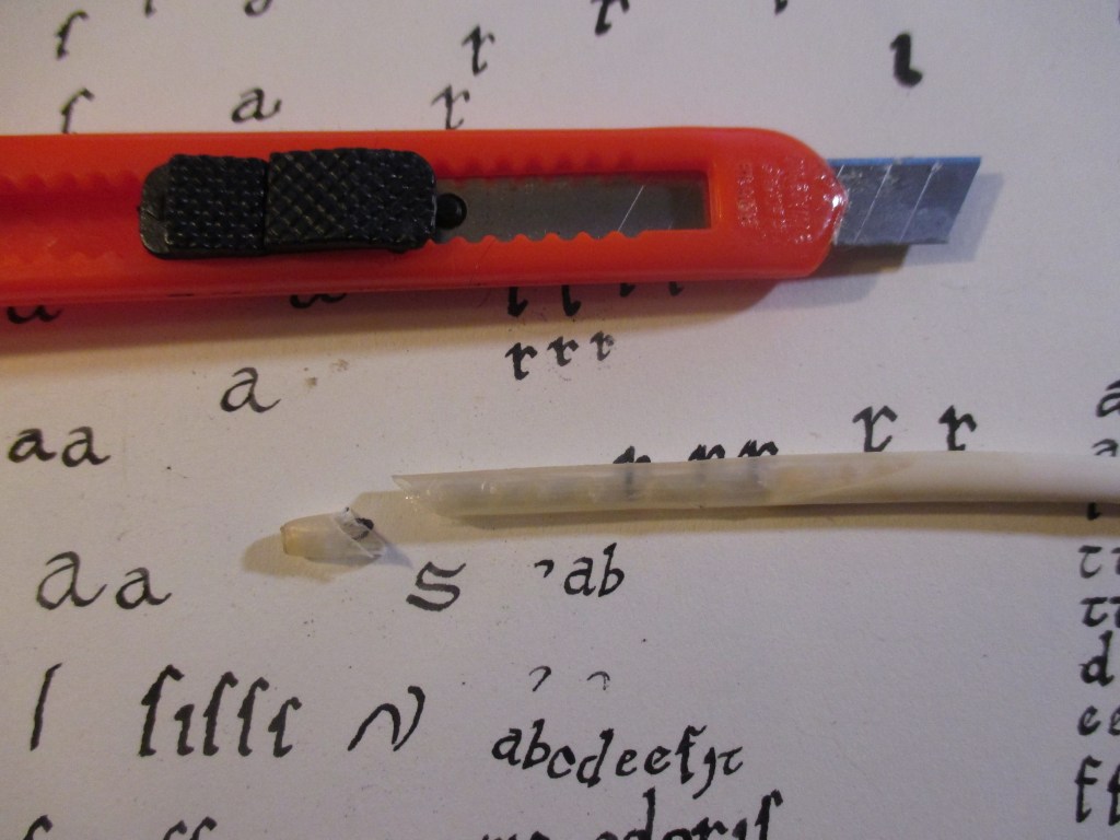
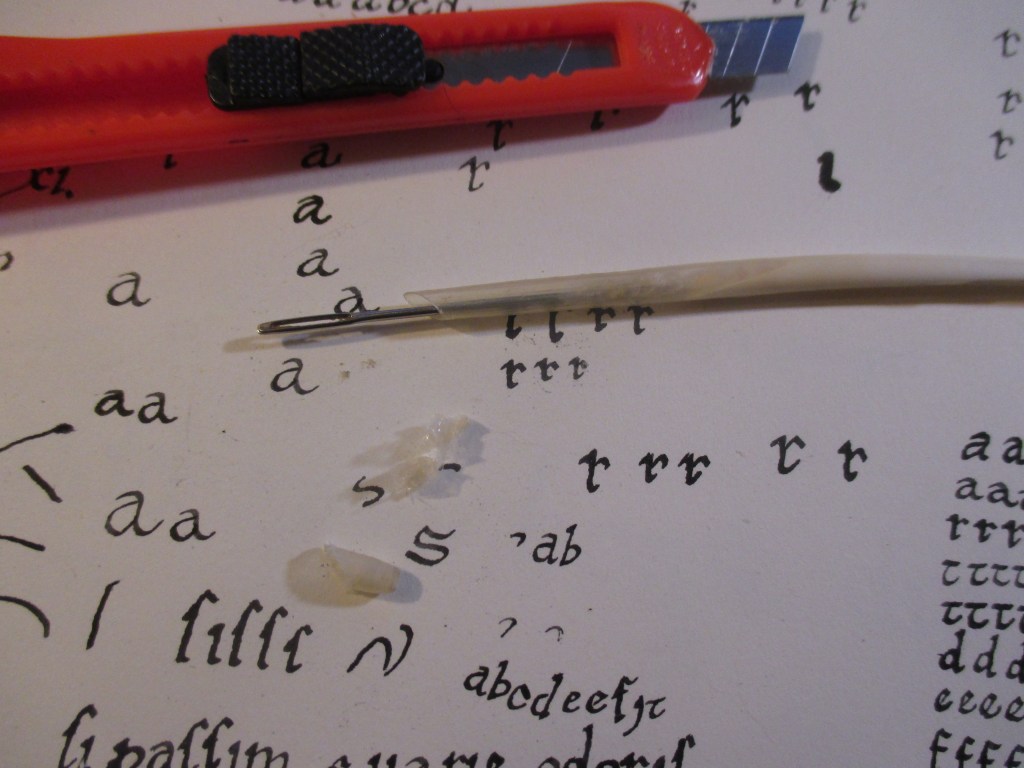
The first step was to temper, or harden the ends of the feathers. This is done by soaking them in water overnight and then sticking them into a container of hot sand for a few minutes. This did seem to create a significant difference in the quill. After this, the vanes of the feather were all stripped away from the shaft, a style which I have noticed in illuminations of my period (Figure 1). The first cut to make the nib was done from the top at roughly a forty degree angle. I then used a needle to remove the pith from inside the feather’s shaft. It is not strictly necessary to clean these bits out to any depth, since the ink will not go very far into the feather. The first cut was met by a second from below at a much more acute angle. This gives the tip two “ears”. I gave the nib its split by pinching these ears together. This creates the necessary gap, but without the risk of making it too large with the parting action of a knife. After that, there was only some minor shaping to form the nib to the correct width and the pen was finished.


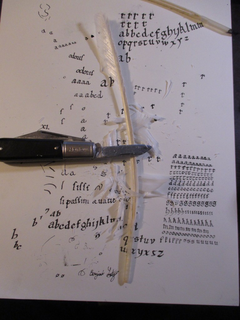


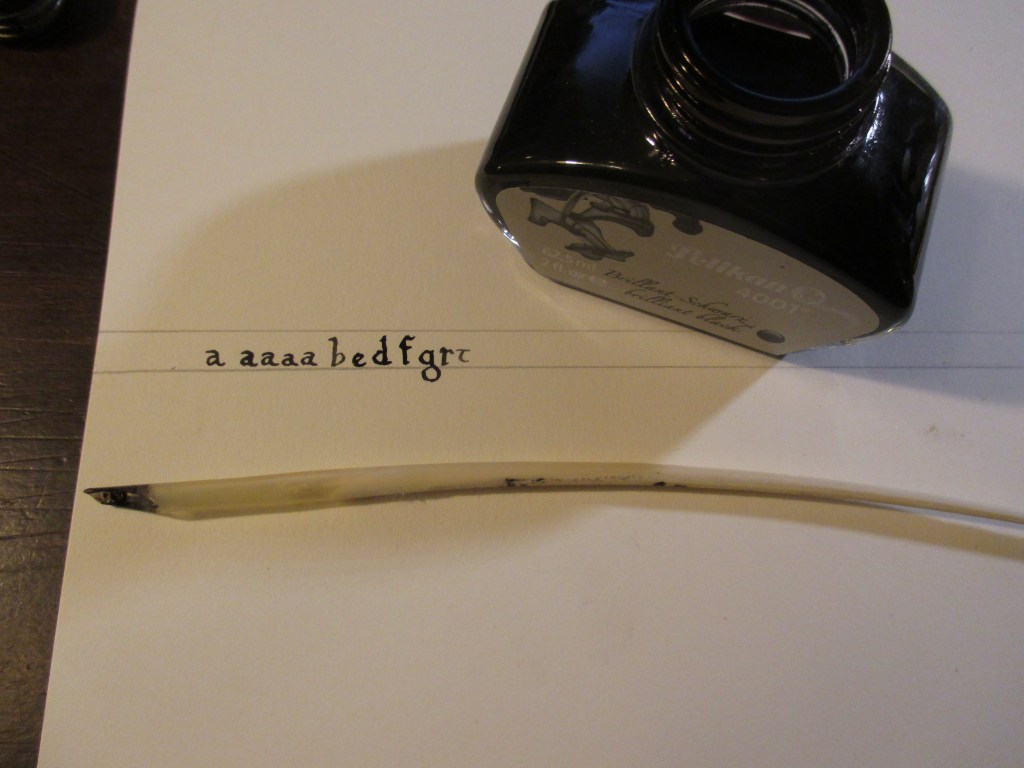
This pen will be a nice step toward improving my calligraphy and making it more authentic. The flexibility of the tip is different from the metal nibs I have used and I can shape it however I please. In reading further about calligraphy done by left handed artists, I found that a position where the left elbow is kept tucked to the person’s center and paper is slightly angled should work. I practiced this technique briefly to write the letters in the last photo of the gallery.
Transcribing an entire book is an enormous task. If I were to write a page of the book every day for two years I would hardly finish. If I ever do finish it will more likely take something like a decade of work off and on. Having my very own hand calligraphed copy of Historia Karoli Magni et Rotholandi isn’t the only point though. I am hoping that working on this project will help me internalize the medieval world slightly better as well as being fantastic practice for future letters or documents I wish to write.
-Getulio
